Readability
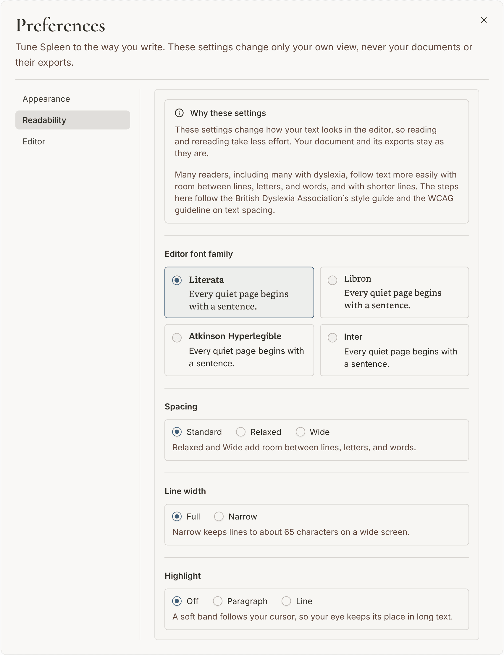
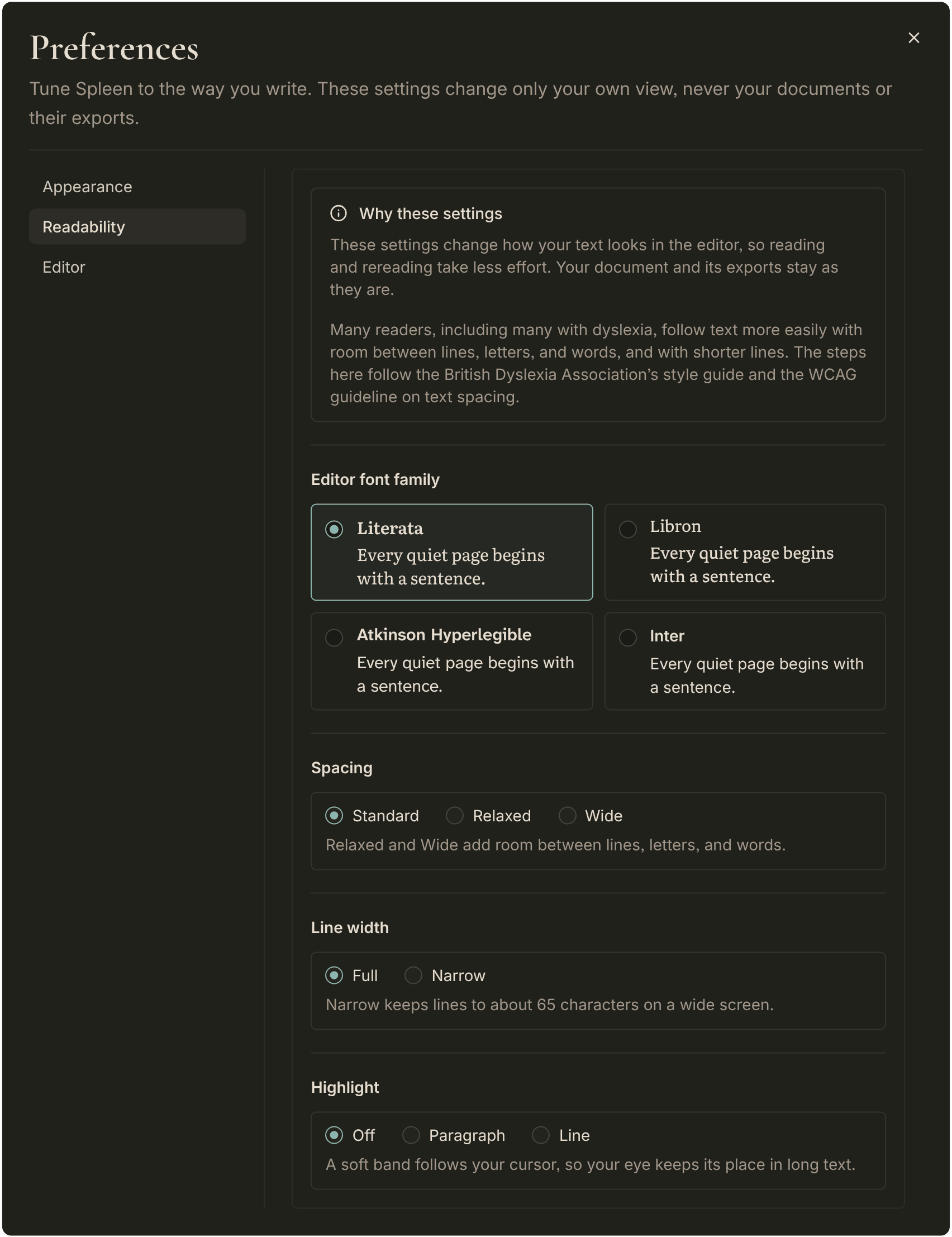
Readability settings change how your text looks in the editor, so reading and rereading take less effort. They never change the document itself or how it is exported.
Many readers, including many with dyslexia, follow text more easily with room between lines, letters, and words, and with shorter lines. The steps Spleen offers follow the British Dyslexia Association's style guide and the WCAG guideline on text spacing. Needs differ from person to person, so try them and keep what helps.
Editor font
Spleen lets you choose the font used for writing:
- Literata is the default serif writing font.
- Libron is a quiet book face with softened serifs.
- Atkinson Hyperlegible was designed by the Braille Institute to make letters easier to tell apart.
- Inter is a clean, modern font without serifs.
You can also switch fonts from the font button in the formatting toolbar.
Spacing
Spacing sets how much room the text gets between lines, letters, and words. Standard is the default. Relaxed opens the text up a little, and Wide opens it up further. Headings keep their own spacing.
Line width
Line width sets how long a line may grow. Full uses the width of the page. Narrow keeps lines to about 65 characters, so your eye has less distance to travel back to the start of the next line. On a phone or in a narrow window, lines are already short, so the setting is not shown there.
Highlight
Highlight lays a soft band behind the text where your cursor is, so your eye keeps its place in a long document. Paragraph marks the whole paragraph. Line marks only the line you are on, like a ruler held under it, and grows with the spacing you chose. Off is the default.
The highlight appears only while you are writing in the editor, and never in exports.
Where these settings are kept
All of these are stored in the current browser. Set them again on another device if you write in more than one place.